Case Study · Brand Identity Refresh
WWAY TV3
Modernizing a trusted news station for the digital era: fresh and contemporary, without losing decades of hard-earned recognition.
Project Overview
A regional news icon.
WWAY is a leading regional news station with decades of community trust and brand recognition. As media consumption shifted heavily toward digital platforms, the station needed a modernized brand identity, one that felt fresh and contemporary while preserving the reliability and familiarity the audience expects.
The goal was not only to update the logo, but to elevate the entire brand presence across broadcast, web, social media, and community outreach.
The Challenge
Recognizable, but aging.
WWAY's previous branding was beginning to show its age. While recognizable, it lacked the cohesion and versatility required for high-definition broadcast graphics, social thumbnails, website headers, and mobile news apps.
Preserve Brand Equity
Modernize the logo without losing the recognition built over decades on air.
Unify the System
Introduce a stronger, more cohesive brand identity system across every touchpoint.
Broadcast Legibility
Enhance visibility and legibility in fast-moving, high-definition broadcast environments.
Consistent Standards
Create color, type, and spacing standards that hold up across all media.
An Unmistakable “3”
Make the channel identity bold and instantly identifiable at any size.
The refreshed identity had to communicate clarity, trust, and authority while projecting energy, relevance, and modern storytelling.
The Solution
A broadcast-ready identity system.
A comprehensive brand refresh centered on a redesigned WWAY logo, built from a broadcast-friendly geometric typeface, balanced spacing, and a strategic color system.
Refined Typography
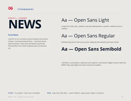
Strong, bold lettering ensures instant recognition on air and online.
Updated Color Palette
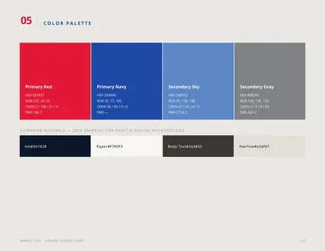
A dual-tone blue adds depth and hierarchy, while the red “3” badge provides an unmistakable channel identifier.
Strong Visual Anchor
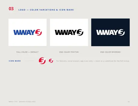
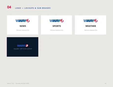
The circular “3” icon works independently across app icons, avatars, mic flags, and social media.
Consistent Brand System
Defined color ratios, clear spacing rules, and adaptable formats keep branding uniform on every platform.
Digital-First Optimization
The wordmark maintains clarity at small sizes, from phones to tablets to streaming apps.
The System
Guidelines for every touchpoint.
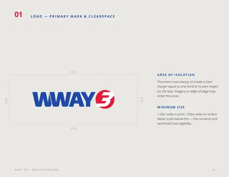
The complete identity ships as a brand guidelines document covering clearspace, color variations, lockups and sub-brands, palette, and typography, so every team and vendor speaks with one confident voice.
The Transformation
Before & after.
- An aging mark showing its years
- Limited versatility for HD broadcast, social, and mobile
- Inconsistent color, type, and spacing across media
- A channel “3” without standalone presence
- A broadcast-friendly geometric wordmark
- Dual-tone blue with an unmistakable red “3” badge
- Defined ratios, spacing, and formats for every platform
- A badge that stands alone on apps, avatars, and mic flags
The Results
Modern, confident, future-ready.
Unified Identity
A brand system that strengthens every visual communication.
Broadcast Readability
Improved legibility across graphics, lower thirds, and live overlays.
Polished Digital Presence
A professional appearance on social platforms and mobile devices.
Increased Recognition
A bold, memorable “3” icon that carries the brand at any size.
Consistent Messaging
One visual voice across marketing, community events, and news programming.
Future-Ready Assets
Flexible formats prepared for emerging digital platforms.